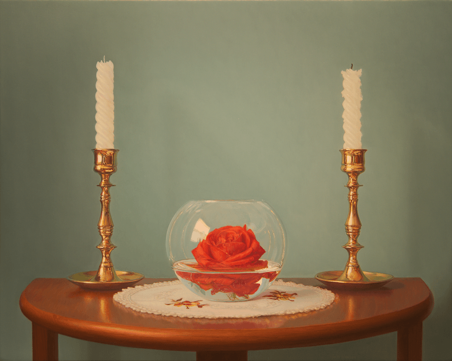
Candles and Rose
- Oil on Panel
- 16" x 20"

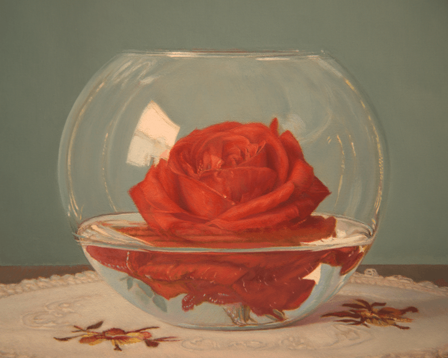
Detail - Candles and Rose
The reference images I captured for this painting remained on my computer for several years before I decided to revisit them. I must admit I'm glad I did, as I was able to create more breathing space around the central objects within this still life composition. I felt I took a risk with the complementary colors here, employing strong statements of red and green. While this color combination is widely used, it can sometimes be challenging to achieve a balanced effect without one color overpowering the other. As I enjoy composing a painting, this work exhibits obvious symmetry and formal placement of elements. There are only a few minor instances of imbalance. The theme of this painting might not be immediately apparent, but I am very pleased with the final result!